Understanding Spectral Transmission Curves

What Is a Spectral Transmission Curve?
Every optical filter selectively blocks some wavelengths of light while allowing others through. A spectral transmission curve is the graph that tells you exactly what gets through and what doesn’t.
Think of it as a bouncer’s guest list for light. Red wavelengths might get waved straight in, green gets a grudging nod, and blue gets turned away at the door. The curve shows you who’s on the list and who isn’t, wavelength by wavelength.
The x-axis shows wavelength in nanometres (nm). The y-axis shows either the percentage of light transmitted or the optical density. More on that difference shortly.
Before we dive into reading curves, let’s ground ourselves in what the wavelengths actually look like. Drag the slider below to explore the visible spectrum:
Everything from roughly 380nm (violet) to 700nm (deep red) is visible light. Every colour you can see lives somewhere on this spectrum, and every filter either passes or blocks specific parts of it.
How to Read a Filter Datasheet
The best way to learn is with a real example. Below is a spectral transmission graph from a Kodak Wratten 2 datasheet, showing the 85 series colour conversion filters:
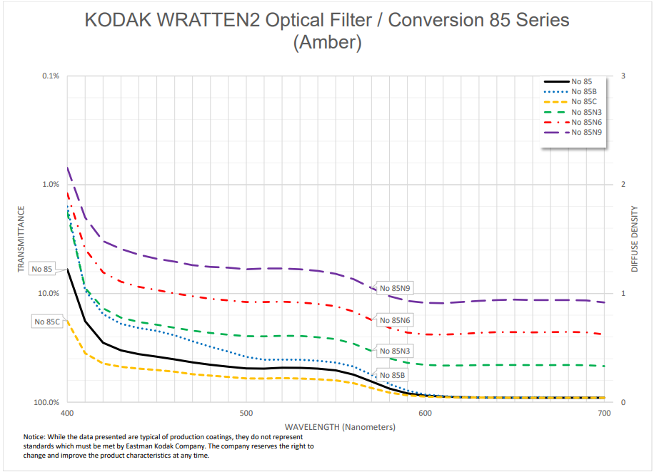
Let’s break down what you’re looking at:
The x-axis runs from approximately 350nm to 700nm, covering the visible spectrum plus a bit of ultraviolet on the left edge.
The y-axis shows optical density, not percentage. This is common on professional datasheets. Higher density = less light getting through. We’ll explain the exact relationship in the next section, but for now: a value near 0 means “nearly all light passes,” and a value of 1 or above means “very little passes.”
The curve itself tells the story. The 85 filter has high density (strong blocking) in the blue region below about 480nm, and low density (free passage) in the red-amber region above 550nm. The transition is gradual, not a hard wall. This is what gives the filter its characteristic warm amber look. You are literally seeing the wavelengths it lets through.
This is a colour temperature conversion filter. Photographers shooting tungsten-balanced film in daylight used the 85 to warm the image from roughly 5500K down to about 3400K. The curve shows you exactly how: it absorbs the excess blue from daylight.
Here’s the same filter in our simulator. Drag the split divider to compare the unfiltered image with the 85 applied:
The warming effect you see in the simulator is the curve in action. Every pixel in the image has had its blue component reduced and its red-amber components preserved, exactly as the spectral curve describes.
Transmission Percentage vs Optical Density
Filter datasheets use one of two scales on the y-axis. Understanding both is essential for reading any curve.
Transmission percentage is the intuitive one. 100% means all light passes, 50% means half, 0% means nothing gets through. Simple.
Optical density (OD) is the professional standard. It’s a logarithmic scale defined by the formula:
OD = −log₁₀(T)
Where T is the fractional transmittance (0 to 1, not a percentage).
Why 0.3 Density Equals One Stop
This trips people up, but it follows directly from the formula. One stop of light loss means halving the light, so T = 0.5:
OD = −log₁₀(0.5) = 0.301
Round that and you get 0.3. That’s why ND filters are labeled in 0.3 increments — each 0.3 is exactly one stop. It’s not an arbitrary number; it falls straight out of the logarithmic relationship between density and transmission.
Here are the key reference values:
- OD 0 = 100% transmission (no filter)
- OD 0.3 ≈ 50% transmission (1 stop)
- OD 0.6 ≈ 25% transmission (2 stops)
- OD 0.9 ≈ 12.5% transmission (3 stops)
- OD 1 = 10% transmission
- OD 2 = 1% transmission
- OD 3 = 0.1% transmission
Why Optical Density Exists
Because when you stack filters, OD values simply add. Stack an ND 0.3 with an ND 0.6 and you get ND 0.9. Three stops total. No multiplication, no fractions, just addition.
In transmission percentages, the same calculation would be 50% × 25% = 12.5%. Correct, but harder to do in your head on location. OD makes the field maths trivial, which is why manufacturers publish in density.
Drag the slider below to see how optical density maps to transmission percentage in real time:
What Filter Curve Shapes Tell You
Once you know how to read the axes, the shape of the curve is where the real information lives. Different shapes mean different types of filters with fundamentally different jobs:
Sharp cutoff: The Red 25 is the textbook example. It blocks essentially everything below about 590nm and then suddenly lets red light through. This hard separation is what creates dramatic B&W contrast effects: anything blue or green in the scene goes dark because the filter simply refuses to let those wavelengths reach the film.
Gradual slope: The Yellow 8 has a gentle roll-off. It starts blocking in the blue region but the transition is smooth, allowing some green and all warm tones through progressively. This makes it a subtle correction filter, the classic “always on” choice for panchromatic B&W film that slightly darkens skies without being heavy-handed.
Smooth broad curve: The Wratten 85 rises steadily across the spectrum, absorbing blue gradually and passing warm tones with increasing efficiency. There’s no hard cutoff anywhere. This is characteristic of colour temperature conversion filters, where the goal is a gentle, natural-looking shift rather than a dramatic one.
Use the interactive chart below to see all three shapes side by side:
Based on spectral data and a generalised sensor model. Results approximate real-world behaviour.
The shapes are instantly recognisable once you know what to look for. A steep cliff means drama. A gentle hill means subtlety. A long ramp means colour correction.
Filter Stacking
When you place two filters on top of each other, their effects combine. The maths depends on which scale you’re using.
In transmission: multiply at each wavelength. If filter A transmits 50% at 550nm and filter B transmits 60% at 550nm, the combined transmission is 50% × 60% = 30%.
In optical density: add at each wavelength. If filter A has OD 0.3 at 550nm and filter B has OD 0.22 at 550nm, the combined density is 0.52. This is the whole reason OD exists: it turns multiplication into addition.
Here’s a practical example. Stacking a Yellow 8 with an Orange 21 narrows the passband more tightly than either filter alone:
Based on spectral data and a generalised sensor model. Results approximate real-world behaviour.
The combined curve sits below both individual curves at every wavelength. The Yellow 8 was already cutting blue; the Orange 21 cuts deeper into the green as well. Together they leave you with a narrow window of warm light. Great for really punchy B&W contrast, but at the cost of significant light loss.
See It on a Photo
Curves are useful, but the whole point is what they do to an actual photograph. Let’s compare a gentle filter with a strong one.
The Yellow 8 is the subtle option. It slightly darkens blue skies and adds a touch of contrast, but the effect is mild. Many film photographers leave a Yellow 8 on permanently:
Now compare that with the Red 25, a sharp-cutoff filter that blocks everything below 590nm. The same scene looks completely different:
The gradual slope of the Yellow 8 gives you a nudge. The sharp cutoff of the Red 25 gives you a shove. Both behaviours are clearly predicted by their spectral curves, which is exactly why learning to read them is worth your time.
Exposure Compensation
Every filter costs you light. The spectral curve tells you how much at each wavelength, but in practice you need one number: how many stops?
The answer comes from the filter’s average density across the visible spectrum. A filter with 0.3 average OD costs roughly 1 stop. A filter with 0.9 average OD costs about 3 stops.
Use the calculator below to see exact filter factors and stops:
Based on spectral data and a generalised sensor model. Results approximate real-world behaviour.
If your camera meters through the lens, it handles the compensation automatically. If you use a handheld meter, add the stops yourself.
Colour Temperature and Filters
Understanding colour temperature ties everything together. Different light sources (daylight, tungsten bulbs, shade) emit light with different spectral distributions. Colour temperature, measured in Kelvin (K), is a shorthand for that distribution.
Colour conversion filters like the Wratten 85 exist specifically to shift this balance. Their smooth, broad spectral curves are designed to redistribute wavelengths in a way that makes one type of light look like another.
Drag the slider below to explore how colour temperature affects the appearance of light:
What’s Next?
If you want to see spectral curves in action on real photographs, head to our filter simulator where you can apply any filter to library images or upload your own photos.
For deep dives into each filter family, check out our individual guides: yellow filters for everyday correction, orange filters for the sweet spot, red filters for maximum drama, and green filters for the foliage specialist. For an overview of all contrast filter families, see our complete guide to colour filters for B&W photography.
Understanding spectral transmission curves is one of those skills that pays dividends forever. Once you can read a curve, no filter is a mystery. You’ll know exactly what it does, why it does it, and whether it’s the right tool for the shot you’re trying to make.
Frequently Asked Questions
What is a spectral transmission curve?
A spectral transmission curve is a graph that shows how much light a filter allows through at each wavelength. The x-axis shows wavelength in nanometres (typically 380 to 700nm), and the y-axis shows either the percentage of light transmitted or the optical density. It is the definitive way to understand exactly what a filter does to light.
How do I read optical density on a filter datasheet?
Optical density uses a logarithmic scale where each increment of 0.3 equals one stop of light loss. Density 0 means 100% transmission, 0.3 means 50% (one stop), 1 means 10%, 2 means 1%, and 3 means 0.1%. Higher density means less light passes through at that wavelength.
Why do filter manufacturers use optical density instead of percentage?
Because optical density values simply add when you stack filters. An ND 0.3 plus an ND 0.6 equals ND 0.9. In transmission percentages you would need to multiply fractions, which is much harder mental maths. OD makes practical calculations trivial.
Can I stack multiple filters together?
Yes. When you stack filters, their transmission values multiply at each wavelength and their optical density values add. This means light loss compounds quickly, and each additional filter narrows the combined passband further. Always check the combined curve before stacking.
What does the shape of a transmission curve tell you about a filter?
A sharp cutoff means the filter blocks everything below or above a specific wavelength, typical of contrast filters like a Red 25. A gradual slope indicates a gentle correction, like a Yellow 8. A smooth broad curve that rises steadily across the spectrum is characteristic of colour temperature conversion filters like a Wratten 85.